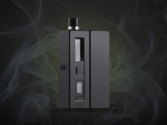
Why Every New Device Looks Like a Gaming Laptop
Angular vents, carbon-fibre-ish plastic and a font called something like 'VELOCITY'. A design investigation.

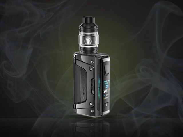
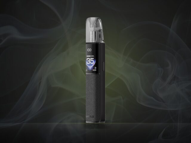
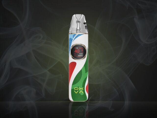
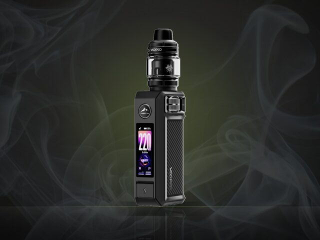
Line up this year’s launches and squint. Angular panels. Fake vents. A finish described as “stealth”. Somewhere, a design meeting decided that “aggressive” was a colour.
How we got here
Devices compete on shelves and in thumbnails. A tiny product photographed against black needs to look like something. Sharp angles photograph well. Calm, useful shapes do not.
Why it matters
Design choices that look good in a thumbnail often feel bad in a pocket. Sharp corners wear through linings. Glossy panels scratch.
A modest proposal
Design for the fortieth day of use, not the first photograph. Some brands already do — they tend to be the ones we quietly recommend.